Before you can insert any text, image or video into Dreamweaver you have to insert an AP DIV.
Once you have inserted an Ap Div you can insert the text, video or image you wish. Having the AP DIV ensures that the item you have inserted can be moved and re sized easily, and it could be said that the AP div acts as a layer in some ways.
I began by creating the header for the website. This will appear on every page within the website in the same position. during my research into existing products it was noticed the the name of the artist who's website it was was written in the font which all of their merchandise is written in and it was either positioned over the top of the main image or in the centre or the left hand side of the border. I have chosen to position the header within the border on the left hand side.
I clicked within the AP DIV I has inserted and the typed in 'Vanessa Carlton'. I then highlighted the text and went to the right hand side of the page where the key tabs are. Here i am able to change the colour, size and type of font. At the bottom of the page I am also able to select the style of the text.
After inserting the header I inserted another AP DIV and inside this AP DIV drew a table.
In this table I inserted the number of columns I needed and wrote the name of each page within the table. I am now able to save this page as a template. Once re opened I can then copy the template as many times as I need to renaming the page each time.
By selecting the page properties and then links I am able to edit the link. This means that when the link is hovered over it can change color and when it is selected it can change color. This aids the navigation for the viewers.
You can clearly see that when the link is rolled over and selected I have decided that it will turn red which ties in with the color scheme that has been decided. Now that I have been able to do this I can link the different pages together. Firstly I will write the name of each page in the middle of the page so I can clearly see that the link works.
Now the link has been set. You need to do this for every button on each page.
After researching website banners in detail I decided that I would create a slide show in Flash. Within this slide show there will be two images and two advertising banners. I have decided to do this because I can see that on the websites of artists of a similar genre and target audience they have sued both images which are featured on other products, images taken on a photo shoot and images used to create advertising banners. From the photography not only I have taken but other member of the group have taken I fell that I have a wide range of images to work with, that conform and reflect the codes and conventions used here. I will now look through the images in detail and then edit the images in Photoshop and use illustrator to create the banners.
Website Banner Creation and Development
This is the original image which I opened into Photoshop and used the effect gallery and color balance tools to edit the image. I also used the crop tool to re size the image so it was the right height and width to fit in the space on the homepage.
After I had opened the image in Photoshop I firstly used the crop tool to crop the image and the opened the filter effects gallery.
I then tried out a variety of effects until I found an effect which i felt was suitable and similar to exiting productions. I also tried to keep the effect similar to effects used on other products created throughout the group. This will show consistency and like all of the designs together.
Here is the final website banner image. I decided to lighted the effect that our group normally used slightly as the image appeared very dark and unsuitable for the banner as well as making the woodland background unclear.
I decided that I would create the website banners in the order which I wanted them to appear in the slide show. I decided that after an image banner i would position an advertising banner.
This is the original image which I opened in Photoshop. This first thing that I did was crop the image before opening the image in the filter gallery to edit. I have decided to use this image as it has a plain background that text can easily be inserted over the top.
I decided to look through the filter gallery and find exactly the same effect as used on the other photographs featured on the products of members of my group. I decided to do this as in this image the background is plain and the lighting effect is effective, which will suit the effect. After I had finished editing the photo on Photoshop I saved the image opened the file in Illustrator.

After opening the file in Illustrator I positioned the text on top of the image a highlighted the key words. I decided to do this as this has been done on existing products and conforms with the codes and conventions. I also decided to do this because of the feedback I obtained on previous products from the target which liked the idea of highlighted text as it catches the viewers eye.The font that I have chosen to use on the banner is the same font I have used for the navigation bar. I have decided to do this due to the results of my research. May artists use the same font style as on the navigation bar for many aspects of the side including, copyright notes, scroll bars, subheadings and adverting banners.
Lastly I found the logo for the iTunes store. I opened the logo in Photoshop to use the magic want to erase the background and then saved the image. I then placed the file in Illustrator and positioned it as shown below.
I decided to include the download able on iTunes button as on existing products of this kind this type of button is featured. So using this on my own product ensures that I have conformed to the codes and conventions. This also means that viewer who look at other websites will be looking out for this link as it is commonly seen on these types of websites.
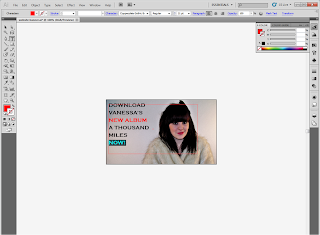
Here is the final copy of the website banner.
For the next website banner I decided to use the same image as I used on the concert ticket design I took to the review. I have decided to do this to show consistency and linkage through the products.
I have not altered this image in any way.
This is the original image which I selected to use for the new poster advertising banner on the website. I deiced to use this image as it is similar to the image featured on one of the poster. I have deiced to do this to firstly conform to the codes and convention and secondly as this image will then attract the views attention as she in wearing red which also ties in with the color scheme. Firstly I opened the image in Adobe Photoshop.
After opening the image I used the magic want tool delete the background and then the eraser tool to deleted any part of the image I did not want that the magic tool did not delete. After I had completed this the image looks as though it does bellow.
I now saved this image in Adobe Photoshop and opened it in Adobe illustrator to complete the banner.
To keep the website banners consistent I used the same font style and color's. As I wanted to place other images in the space I have also decided to center align the text so the space does not look too crowded. I will not import the two poster I have created as part of the merchandise. I will firstly re-size the images and then slant one of them.
Here is the final product. The next step is to import the images into flash and create the banner.
The first step that I took was deciding how big I wanted the banner to be. Once i had decided this I changed the size of the background I was working within flash.
The next thing that I had to do was save all the banners as a JPEG and then import them into the library in Flash.
I then put the images into the order I wanted them to appear and re sized each image to the correct size. ( the same size as the background) I then inserted a key frame so I could begin making the moving slide show of banners. In the first key frame i moved the image along five spaces and then inserted a new key frame. I continued to do this until i was able to add another image. ( you add another image when you see the white background appear). This is how you Flash will look at this stage.
You continue to do this as you add the other images you want to include. As shown below.
After you have added all of the images you wish to include press Ctrl + Enter and you slide show will play.
Once you have completed the slide show, the next step you take is to export the video. You do this by going to file and then export and then export video. Now you will be able to make an AP DIV and insert your slide show.
This is how the slide show looked after I inserted the finished movie into Dreamweaver.
I decided that the rest of the homage was going to follow a similar layout to that of the website of Taylor Swift. I decided to do this as Taylor swift is of a similar target audience and genre to Vanessa Carlton. I also decided to do this as i know from my A level ICT that interactivity is Key when creating a website and the basic layout and interactivity used especially on the home page of this website is strong. The homepage of Taylor swift website has a range of button, links, advertisements and updates which are written in square boxes. This part of the page also has an image which has been cut up like a jigsaw and pieced together. I have decided that I will find an image suitable to do this too and that ties in wit existing photography used within the website banner.
This is the image which I edited in Photoshop and then cropped into different sections so it could be incorporated into the buttons on the homepage. To ensure that the sizing was correct for each segment I inserted AP DIVS into Dreamweaver and looked at the measurements.
The only thing that I changed about the image was to add a black and white effect.
I then cropped the image and re saving each segment after it had been cropped. Below are the saved cropped segments which I then imported in to separate AP DIVS in Dreamweaver.
This is how the segments look now they have been positioned in Dreamweaver. As you can see I have selected to use a similar image as on this advertising banner.
The next step that I will take is adding a scrolling bar between the slide show and square segments. I have decided to include this as it is another form of interactive which is eye catching and engaging for the viewer as well as a means to different messages across to different people. It is important to include this on a website as the scroll bar can advertise event and products which the purchaser has to spend money to have. I also catches the viewers eye and they will look through the website to find what they have seen advertised. I am able to include an advertising banner as it is suitable for my target audience a it has been proven people of that age are able to take information in like this.
I decided that I would create the scroll bar not in Flash but in Dreamweaver itself .
The first thing that i did was split the screen in Dreamweaver, entered the code need to create the scroll bar and then entered the text which I wanted to be shown in the scroll bar.
This is how the scroll bar looks now it has been added to the site.
I will now continue to work on the square segments, which will either be a button, advertisement, video, slide show or link. I have decided that each box will have a white background which will stand out on the black background with a red box for the header. I will create these in using Photoshop and Illustrator.
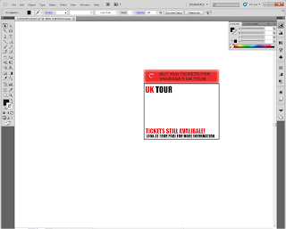
Here is one of the advertising options I have created to advertise Vanessa UK Tour. I have decided to categories the links with a letter in the top left hand corner. The letter for this link will be T for Tour. If the user selects this square it will take them to the tour page where they can purchase tickets.
Here is how I created this link:
The first step that I took when creating this link was to insert a red box which will be the header. Inside the header is were the text or title of the content of the box will be written.
I decided that I would use an effect on the colored box so I opened the filter gallery.
I had already decided that I wanted to blur the edges of the box so that they where not sharp.
This is the effect that I selected to use.
I then created a black box around the edge of the white box so I could clearly see the space i had to work with. After this I created two text boxes, in the first I wrote the letter T. I wrote this using the same font used to write Vanessa Carlton, so there is a clear link. In the second I wrote the title of the box. I decided to write this in the same font style used for the headings and scroll bar so there is consistency shown. I have also decided to do this as in my research this feature has come to light as a convention used by existing websites of this genre and target audience.

I then created two more text boxes. In the first text box I wrote 'UK TOUR' in large letters. I have decided to do this as I want the words to be eye catching and stand out. I have also changed the color of the UK from black to red. I decided to do this to tie in with the website banners. I did the same with the information (copy) i positioned in the second text box ensuring that the most important bits of information are written in red.
Lastly I inserted the concert ticket. I decided to slant the ticket so firstly the size of the ticket could be larger, secondly so there was less white space and thirdly as this will catch the viewers eye.
I will follow this process for the creation of the other links
This is how the website looks now the links I have created have been added.
As you can see not all of the links are completed. This is because I am waiting for the other member of the group to finish their ancillary tasks so they can be included within the website, as well as waiting for their final video to be finished so I can upload the video. Where I have positioned the album cover I wish to create a slide show of the album front and back as well as the digi pack. Furthermore in this print screen you can also see how the navigation bar changes to red when the mouse is hovered over the link to the page.
I then inserted a text rollover on to the image. This means that when the image is rolled over alternate text will appear.
Here you can see where I have entered the alternate text.
After I entered the alternate text for all of the pages I then linked the squares to the main pages within the website.
When I selected the button titled the latest forum posts the button took me to the news page. This is because the button (CONTENTS ONE) has been linked to the news page as shown bellow.
The next interactive feature I will create for the website homepage is the music player. I will create this a Flash. To create this music player I followed this tutorial but changed the design of the player. I was able to use the tutorial to find out the correct coding and way in which to begin creation.
This is how the music player looks when it has been positioned in to the website. The music player plays the song a Thousand Miles, which we have advertised as the latest song by Vanessa Carlton. I have decided to use this song as I noticed in my research that the first song played by artists on their website was their latest song. So by doing this I have conformed to the codes and conventions.
As well all products that are created there is a copy right for the site and images, this is a code and convention. Whilst researching into existing websites I noticed that the majority positioned these rights and the bottom of the page with the copyright sign/logo.
This is how the homepage of the website looks after taking all the steps I have shown above. I will now wait for the other members of the group to finish their ancillaries so that I can position them on the homage, As well as finishing the creation of the video so I can insert that onto the homepage as well.


